
In the digital age, a responsive WordPress design is no longer a luxury, but a necessity. It’s the cornerstone of a successful online presence, ensuring your website is accessible and user-friendly across all devices.
This article delves into the best practices for responsive WordPress design. It’s a comprehensive guide for brand managers, content creators, and digital marketing specialists. The aim is to help you create a seamless user experience, enhancing your brand’s digital presence.
From principles of fluid grids to the role of plugins, we’ll explore strategies to optimize your website’s responsiveness. Let’s dive into the world of responsive WordPress design.
The Imperative of Responsive Design in a Mobile-First World
In today’s mobile-first world, responsive design is paramount. It ensures your website adapts to the screen size of any device, providing a seamless user experience.
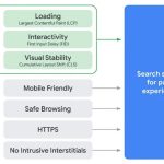
Moreover, responsive design significantly impacts SEO. Search engines like Google prioritize mobile-friendly websites, boosting your visibility in search results. Thus, a responsive WordPress design is not just about aesthetics, but also about enhancing your brand’s digital presence.
Principles of Fluid Grids and Flexible Images
Responsive WordPress design relies heavily on fluid grids and flexible images. Fluid grids allow your website layout to adjust dynamically based on the screen size. Flexible images, on the other hand, ensure that your visuals are not distorted or cropped on different devices. They automatically resize to fit the screen, maintaining the visual integrity of your website.
Media Queries: The Backbone of Responsive WordPress Design
Media queries are a crucial component of responsive WordPress design. They allow you to apply different CSS styles based on the characteristics of the device.
For instance, you can set specific styles for screens smaller than 600px wide. This ensures your website looks and functions optimally on all devices, from smartphones to large desktop monitors.
Selecting and Customizing Responsive WordPress Themes Choosing the right WordPress theme is a critical step in creating a responsive website. The theme should align with your brand identity and be designed with responsiveness in mind.
Once selected, customization is key. Tailoring the theme to your brand ensures consistency across devices. This includes adjusting colors, fonts, and layout elements to match your brand’s aesthetic.
The Role of Plugins in Enhancing Website Responsiveness
Plugins can significantly enhance the responsiveness of your WordPress site. They offer additional functionality and can optimize your site for different devices.
However, it’s crucial to choose plugins wisely. Too many can slow down your site, negating the benefits of a responsive design.
Mobile-First Approach and Its Benefits for SEO
Adopting a mobile-first approach is a strategic move in responsive WordPress design. It ensures your site performs optimally on mobile devices, where a majority of users access the web.
Moreover, Google’s mobile-first indexing rewards sites optimized for mobile. This can significantly boost your SEO rankings.
Optimizing Loading Times for Peak Performance
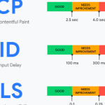
Website loading speed is a critical factor in user experience and SEO. A responsive WordPress design must prioritize fast loading times to retain users and improve search rankings. Optimizing images, leveraging browser caching, and minimizing HTTP requests are some strategies to enhance website performance.
Embracing Minimalist Design for Better Responsiveness
A minimalist design approach can significantly improve website responsiveness. It reduces clutter, enhances readability, and improves loading times.
Incorporating white space, using simple typography, and focusing on essential elements are key to a minimalist, responsive WordPress design.